
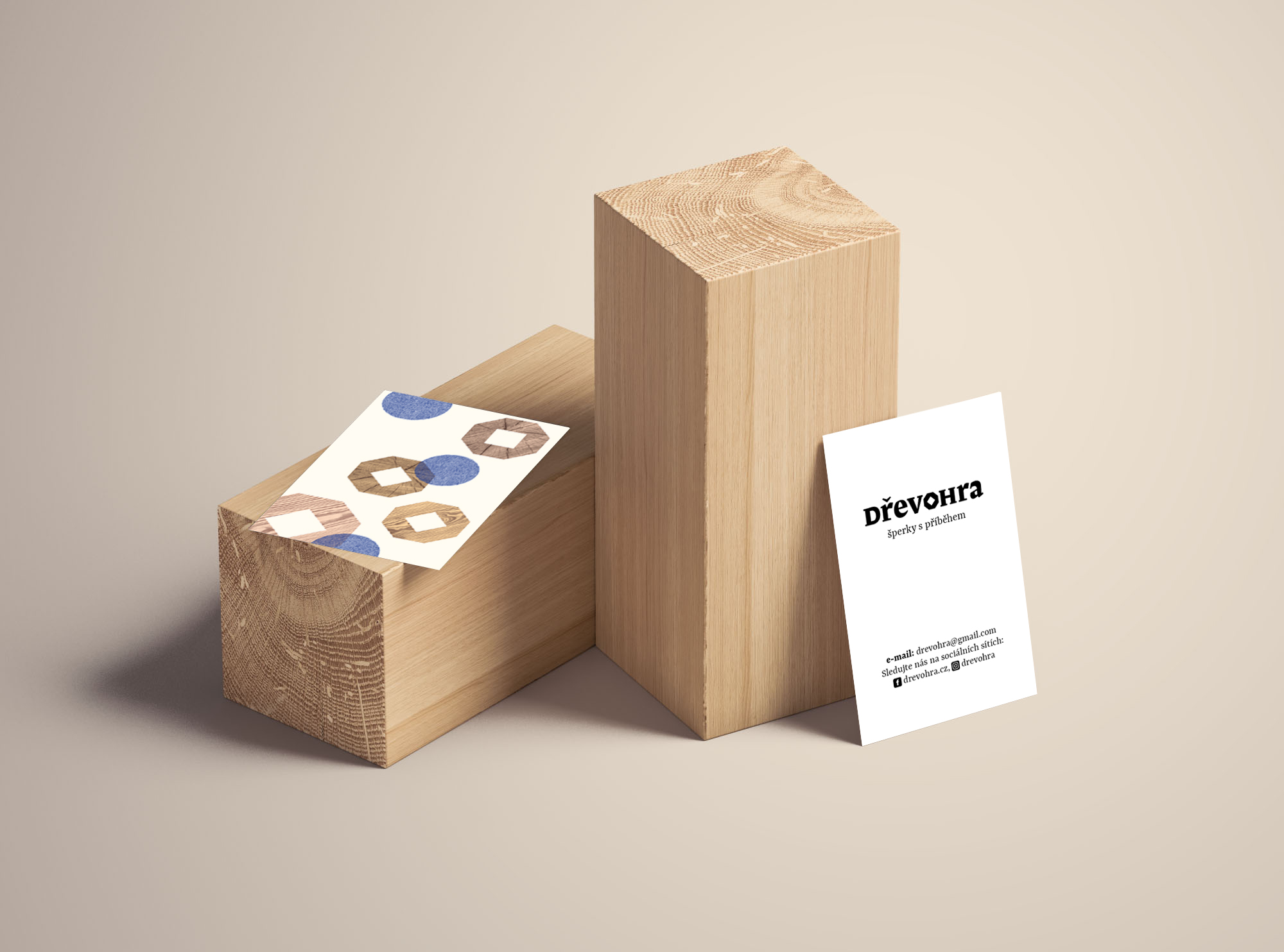
Dřevohra
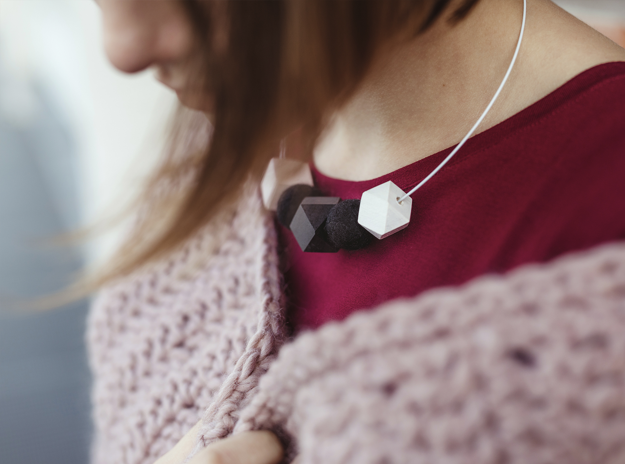
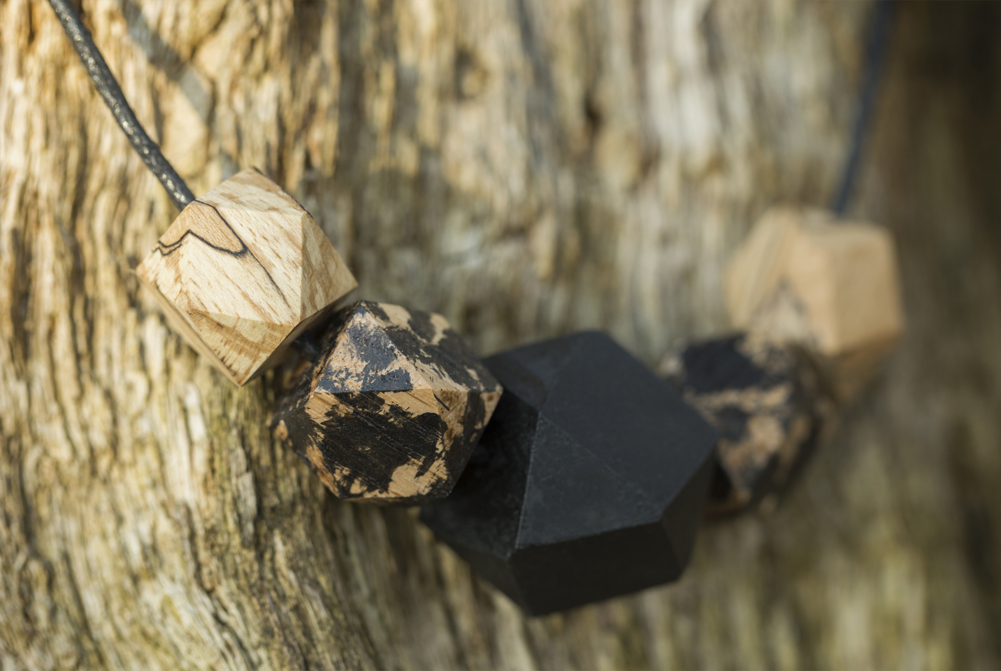
Dřevohra is a jewellery brand by Mirka and Luděk Szórád. Their jewellery of all shapes and colours is handmade – Luděk’s job is to cut, drill and grind, and Mirka designs the colour combinations and final arrangements. Every piece of their jewellery is unique, not only because it’s handmade, but also because the pieces of wood are of a different colour and texture each time.
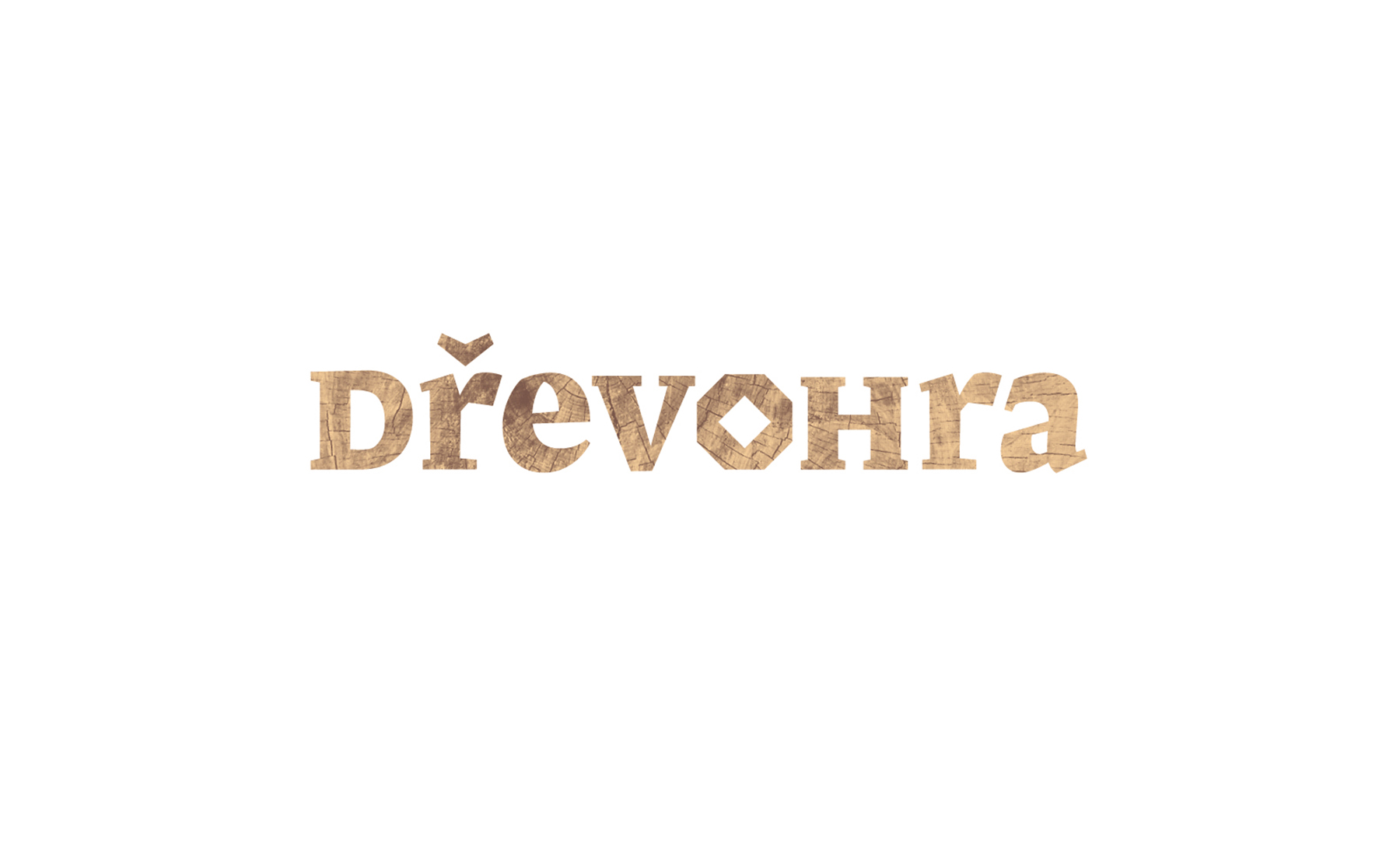
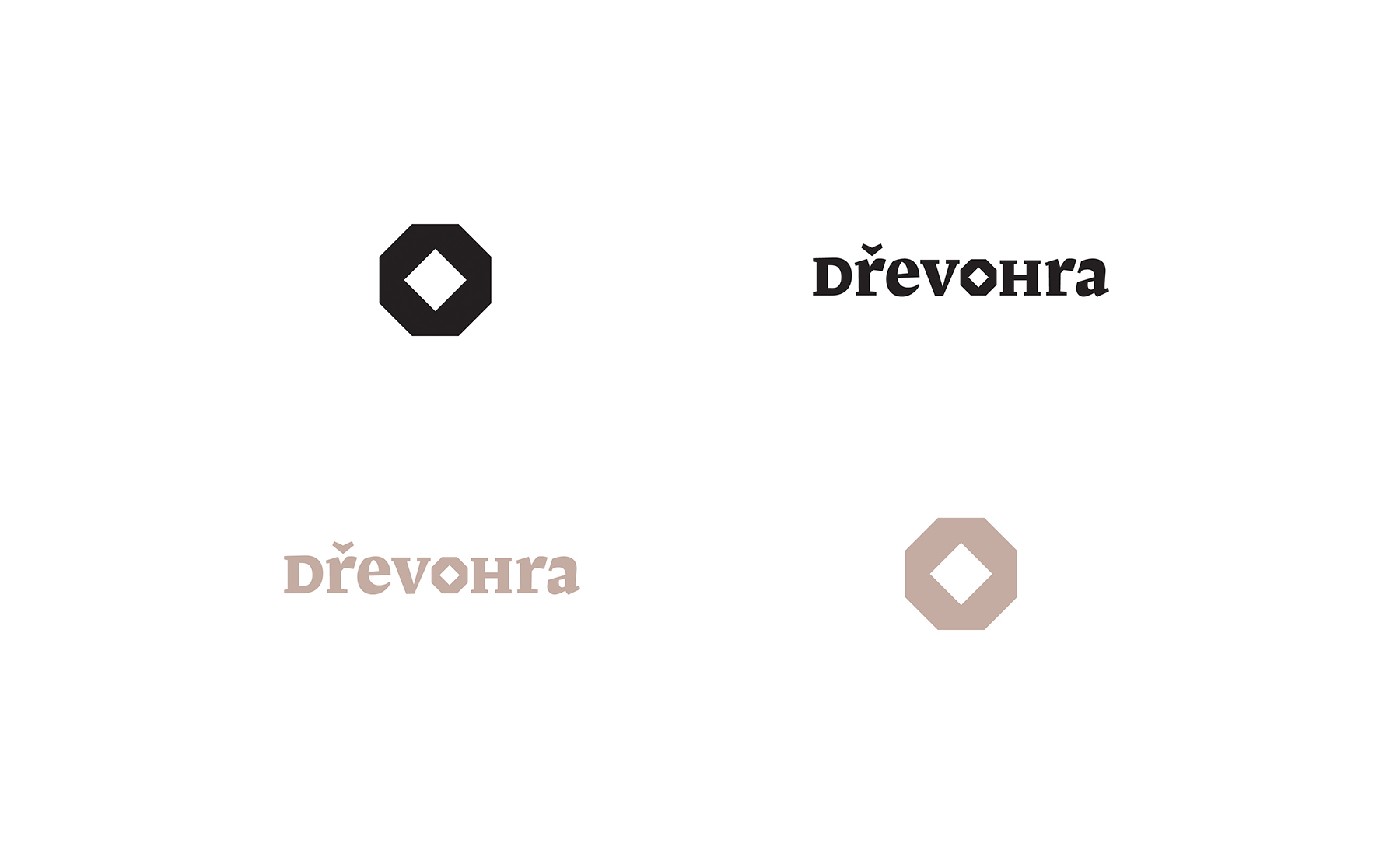
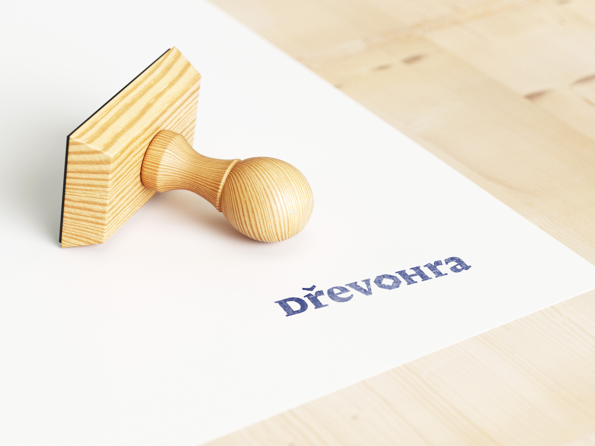
For Dřevohra, I created a typographic brand whose letter shapes evoke the image of woodcut – a classical printing technique that uses relief printing on smoothed wooden boards. Coarse and rugged drawings are typical of woodcut. That’s why I chose a font that doesn’t have any shading or brackets; its strokes are significantly angled and its serifs very high. I also modified the font; the most significant change is with the letter O, which has a unique shape and can be taken from the brand and used on its own.
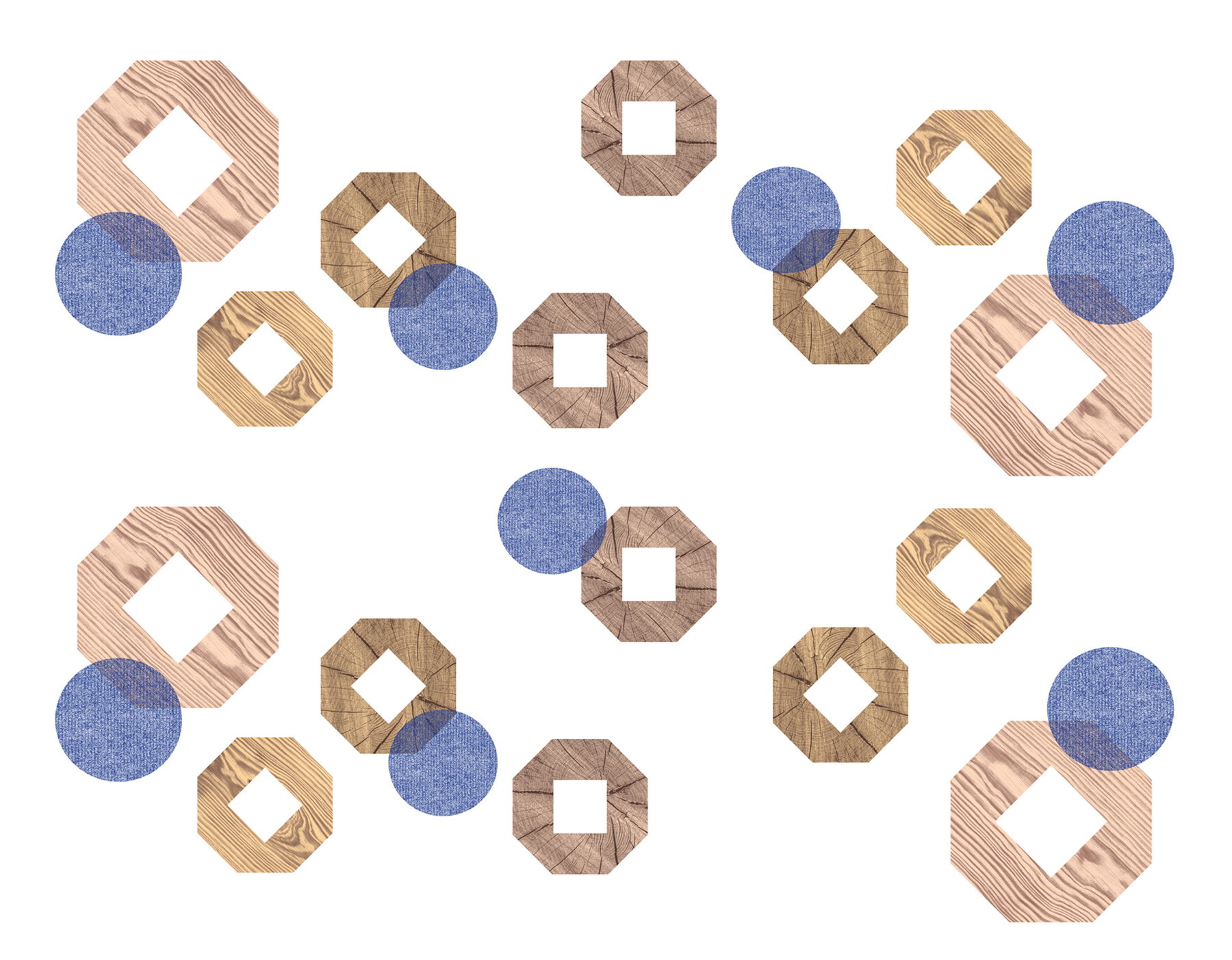
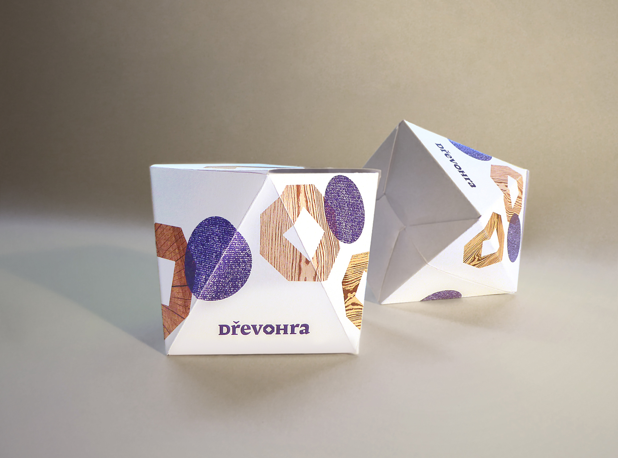
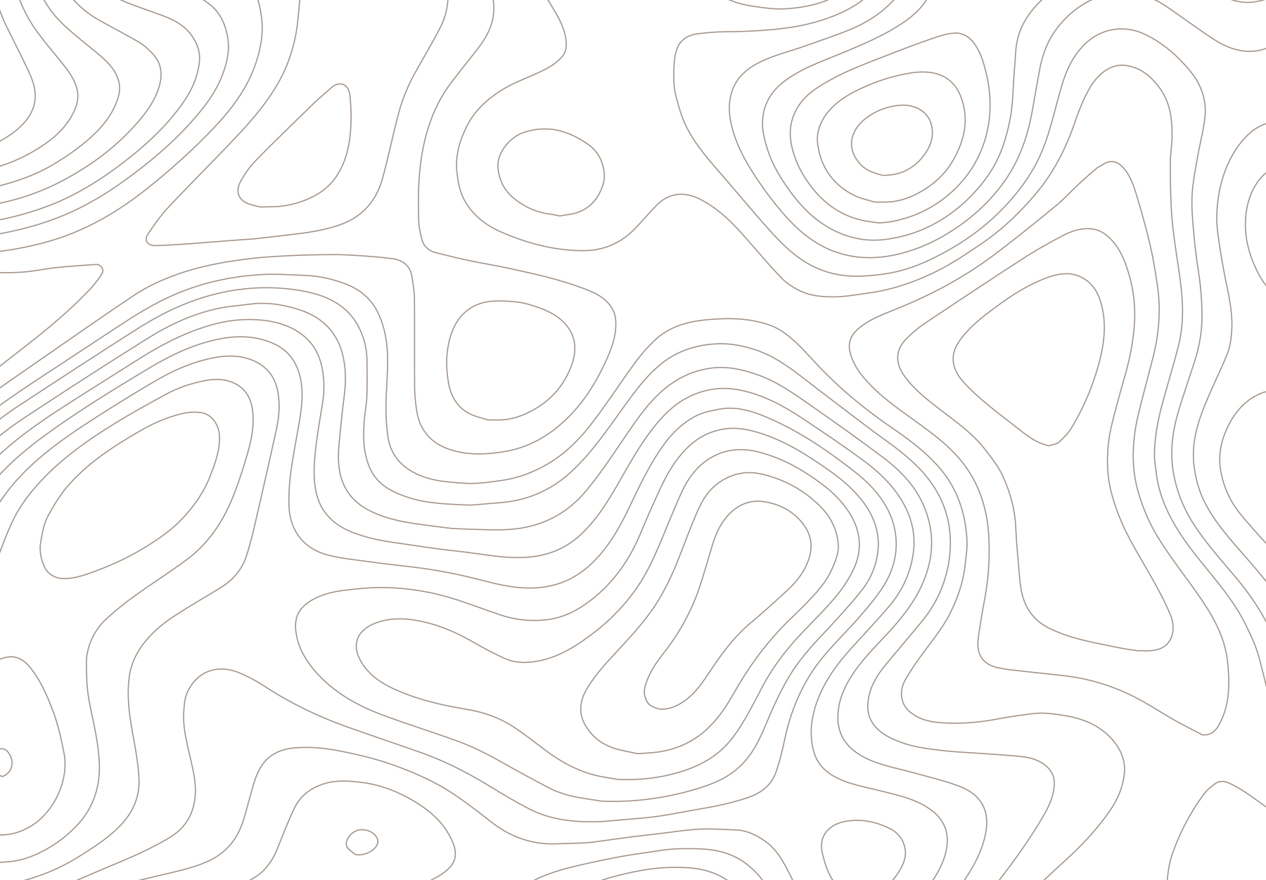
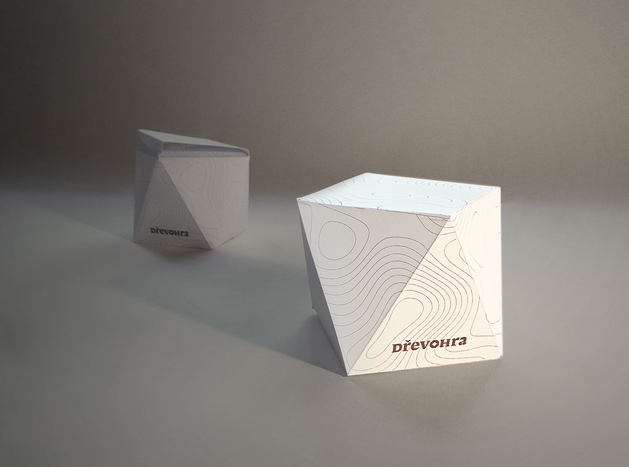
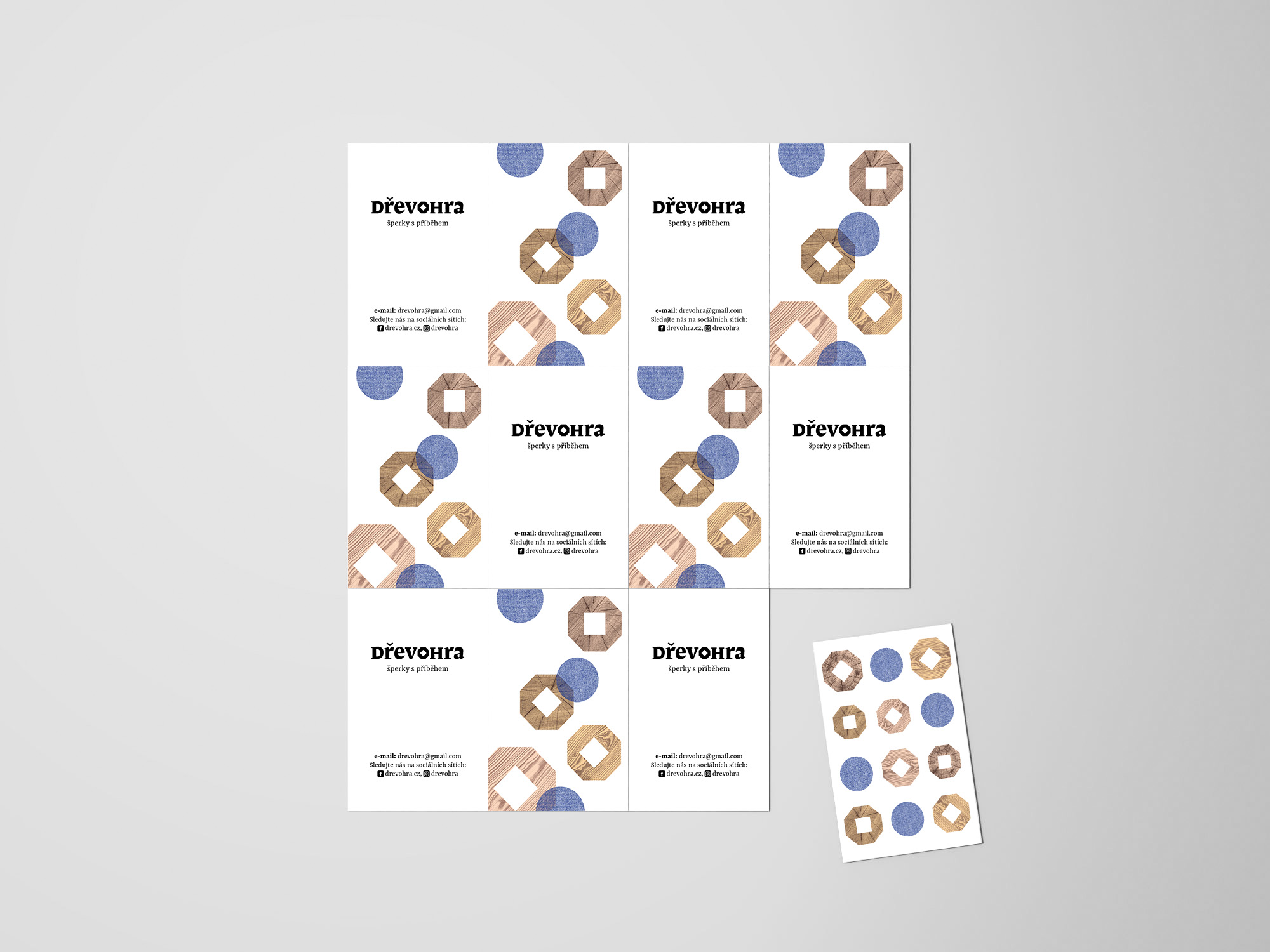
As a visual extension, I created art motifs for two jewellery collections. A motif with randomly placed elements of wood and felt patterns has been designed for combined-materials jewellery and a motif of annual rings drawn in line for all-wood collections. These motifs are used on accompanying printed materials and are a part of a new design of jewellery packaging – a paper gift box whose shape follows the wooden beads of Dřevohra’s jewellery. This creates design harmony between a piece of jewellery and its packaging.