
Igor Hubinsky – Law Firm
In Igor Hubinský’s law firm, cases are considered from various points of view, so that the best way to solve a specific legal case can be found. The new brand that I designed for the firm thematizes this complex approach – more ways of looking at one thing.
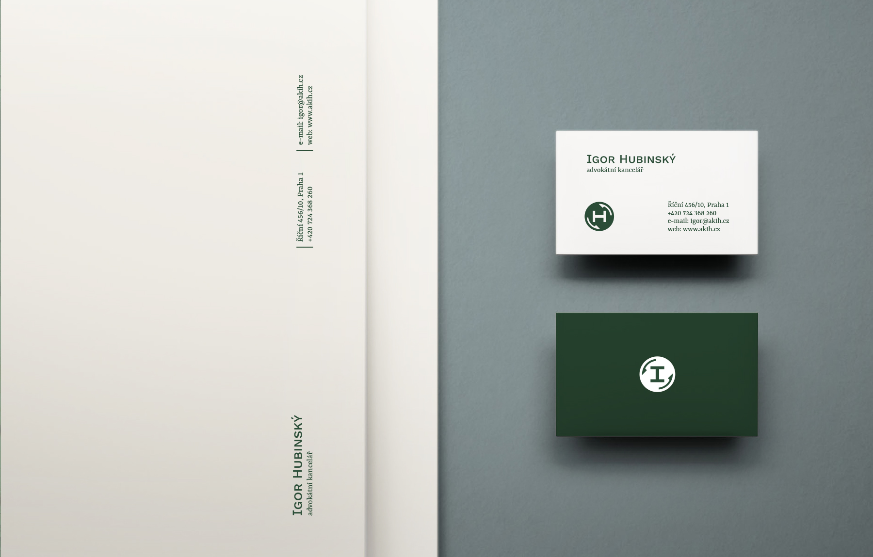
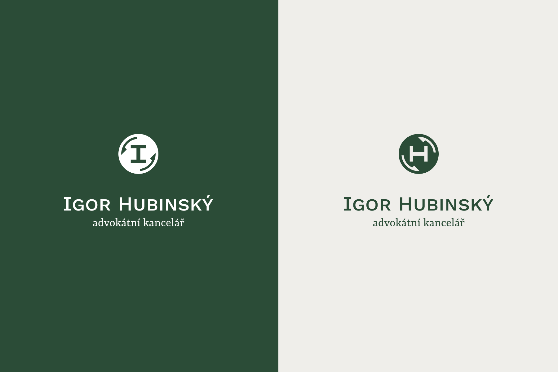
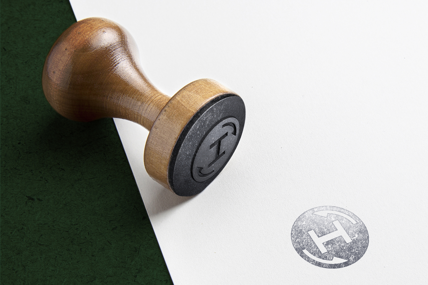
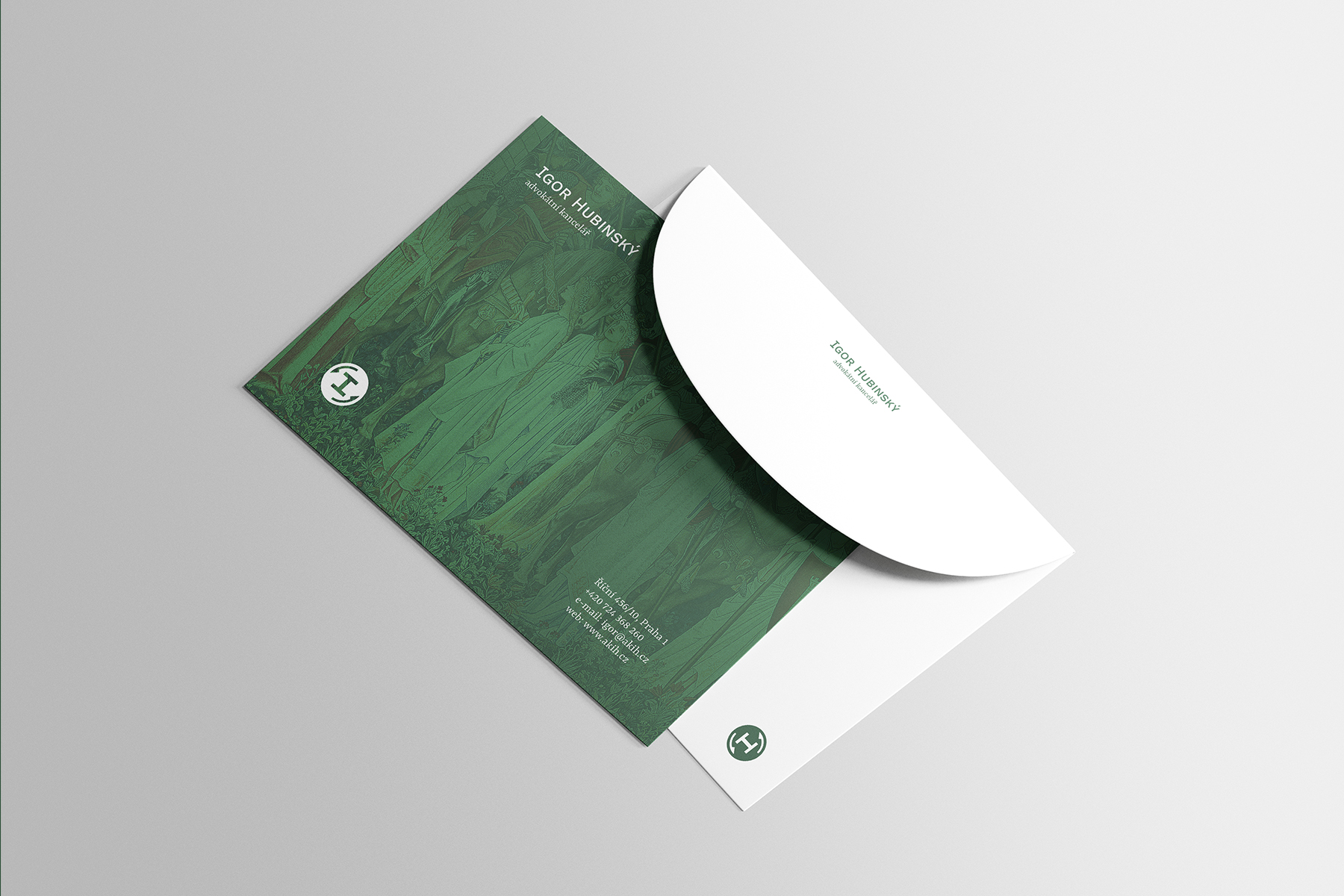
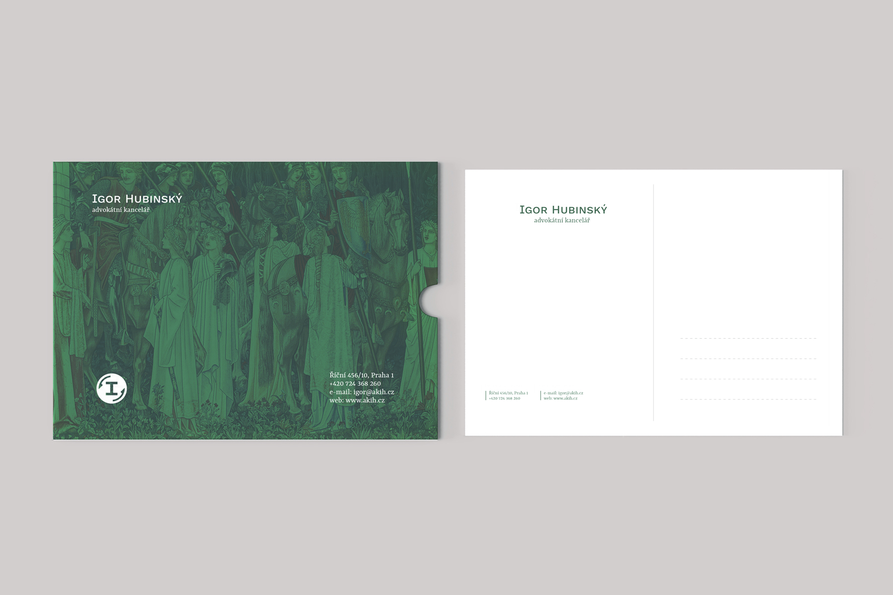
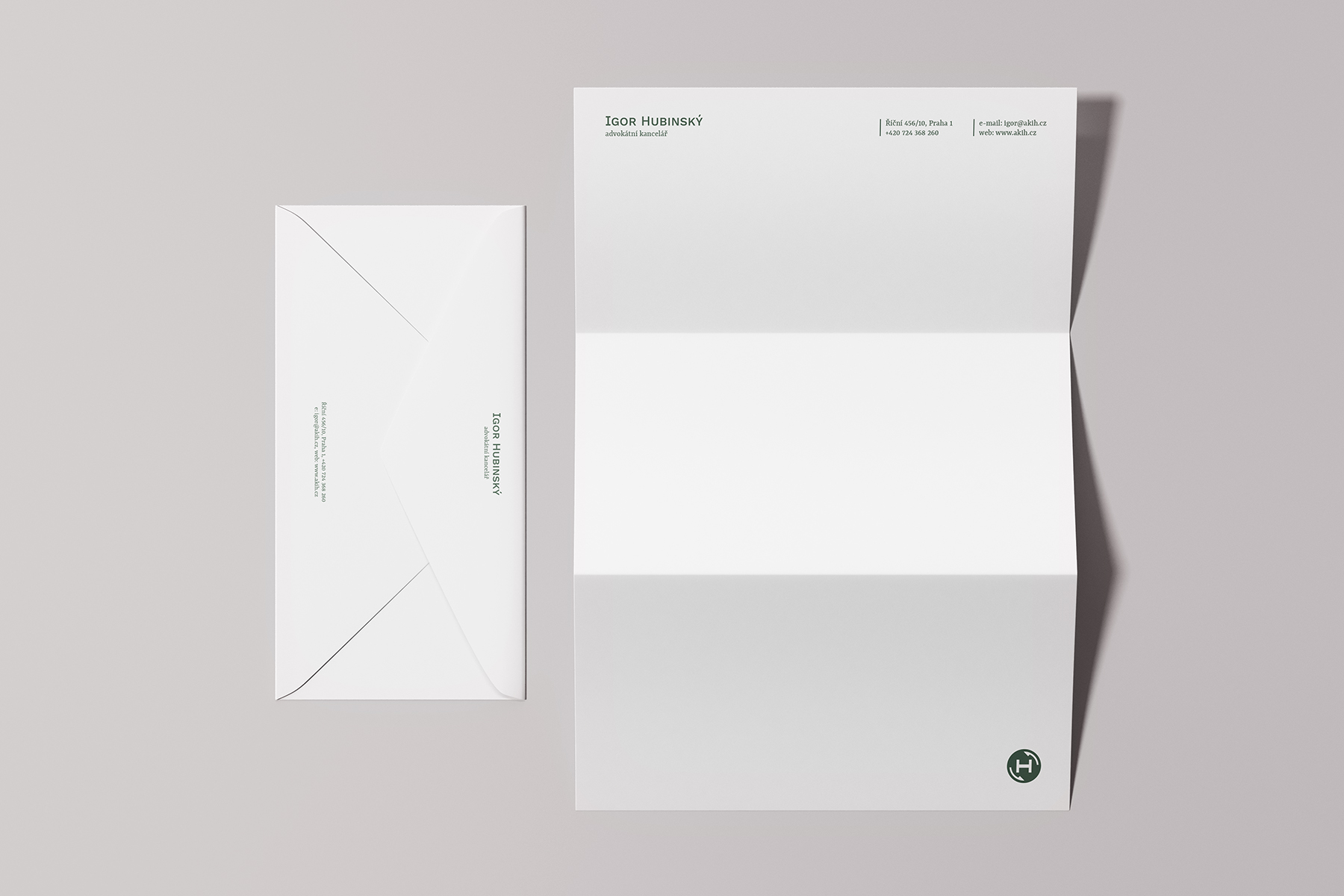
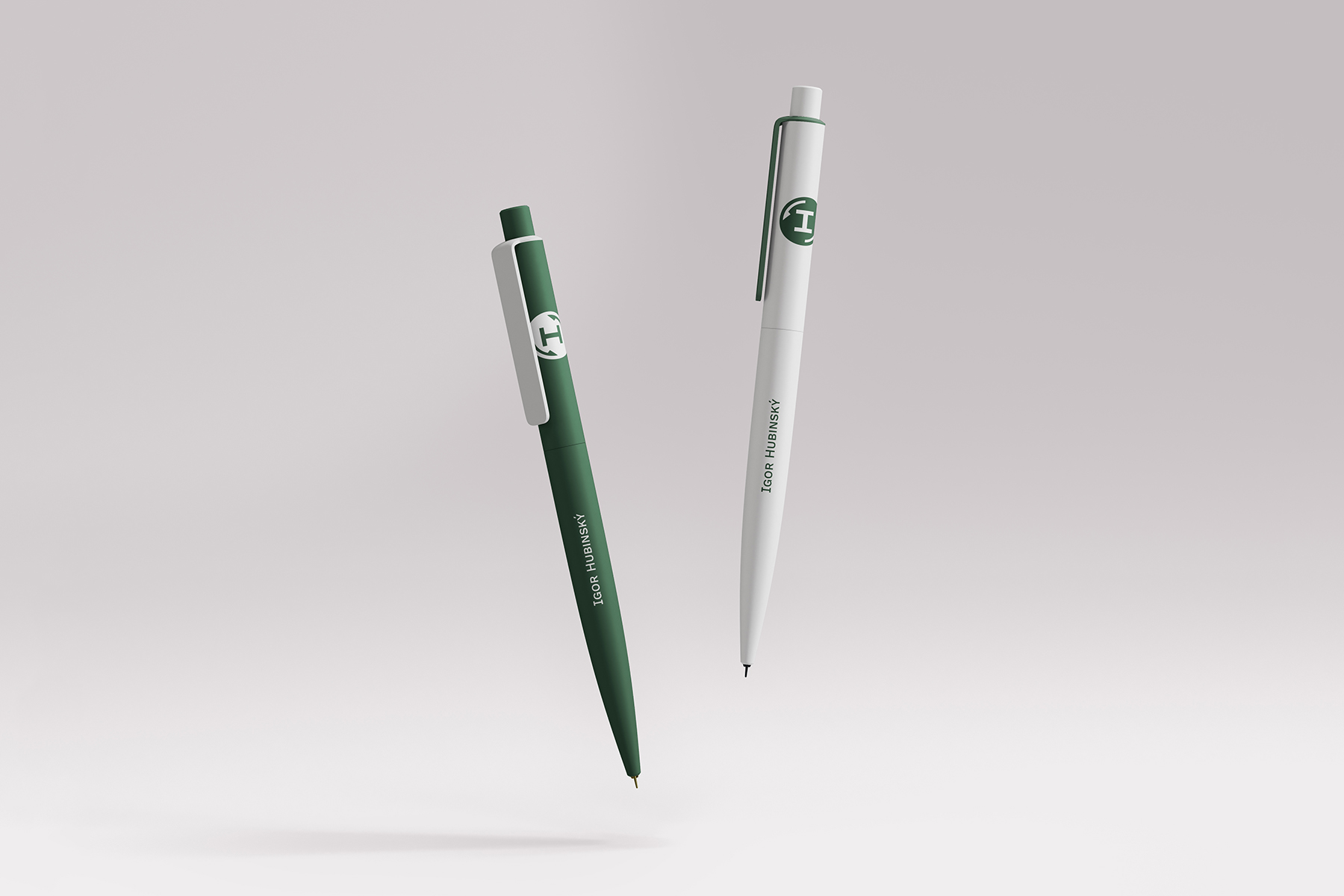
I created a visual style which is dominated by a specific monogram. I utilized the similarity between letters I and H and connected them into one shape. The resulting graphic symbol changes its content when it’s rotated – one is I for Igor, the other is H for Hubinský. The brand therefore contains two „different“ equal versions of the symbol.
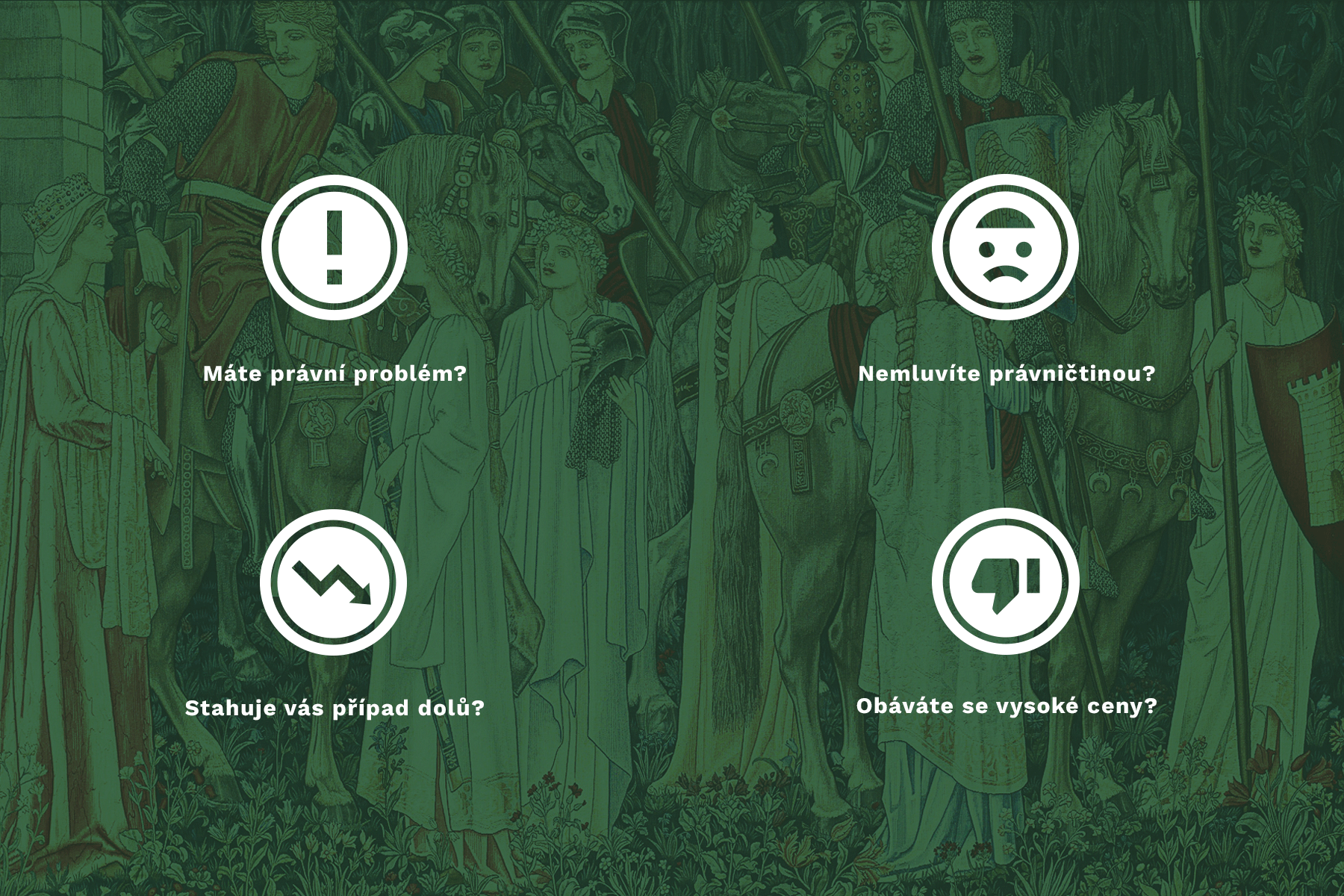
I used the same principle to create a set of icons – an exclamation mark (which symbolizes a problem) becomes a symbol for information when it’s rotated. Similarly, an arrow pointing to the ground rotates to point upwards, and a thumbs down symbol changes to the thumbs up.
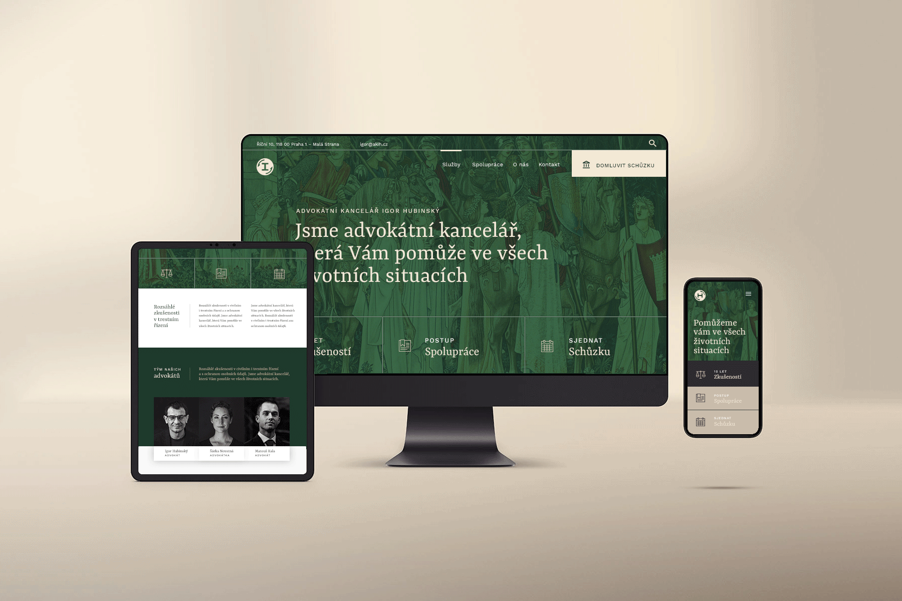
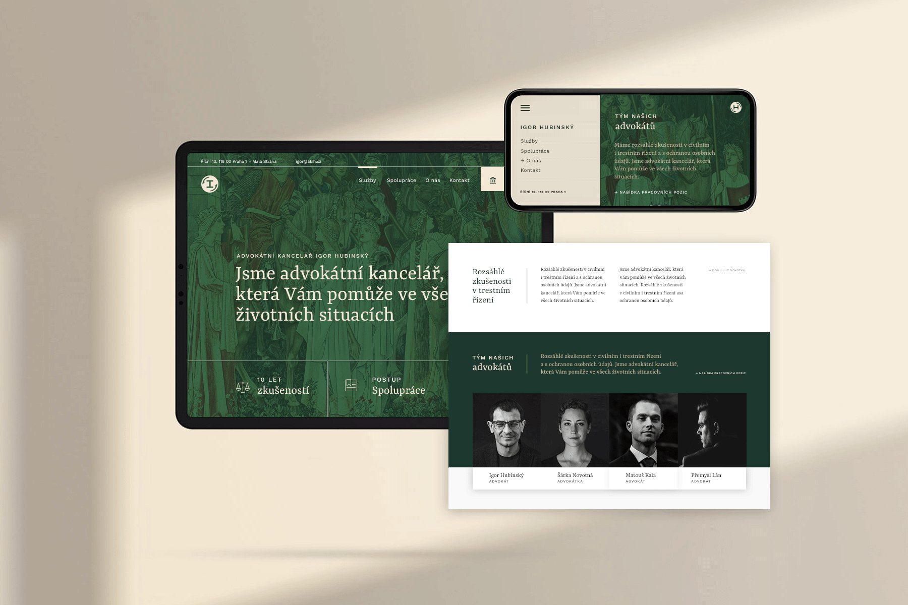
Even though the whole identity is based on an unconventional animated logo, I managed to keep it visually serious and very elegant. I used shades of dark green and valera beige and a serif font together with classical drawing.
The guarantor of my work on the brand was Míša Bartáková from Bartvisions, to whom I owe my thanks for her invaluable advice and for settingme in the right direction.