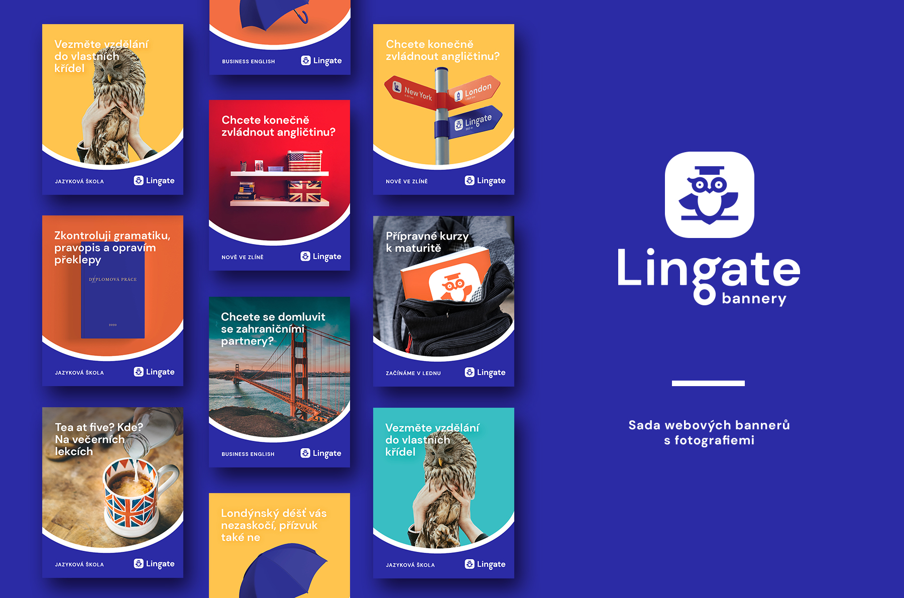
Lingate
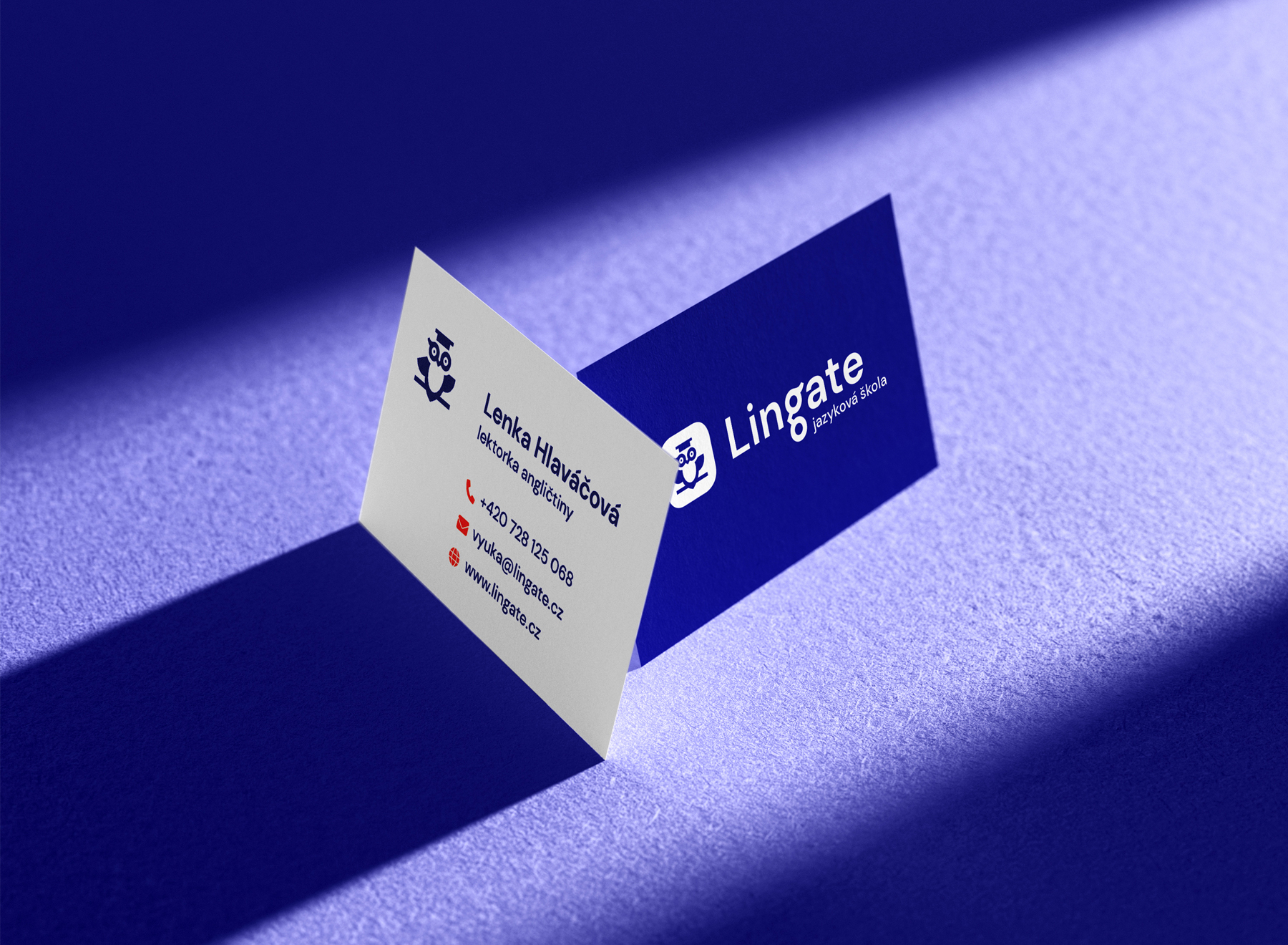
Lingate is a language school in Zlín run by Lenka Hlaváčová, an EFL teacher and the school’s founder. It was established last autumn and I have, thanks to Lenka, been a part of the project since the very beginning.
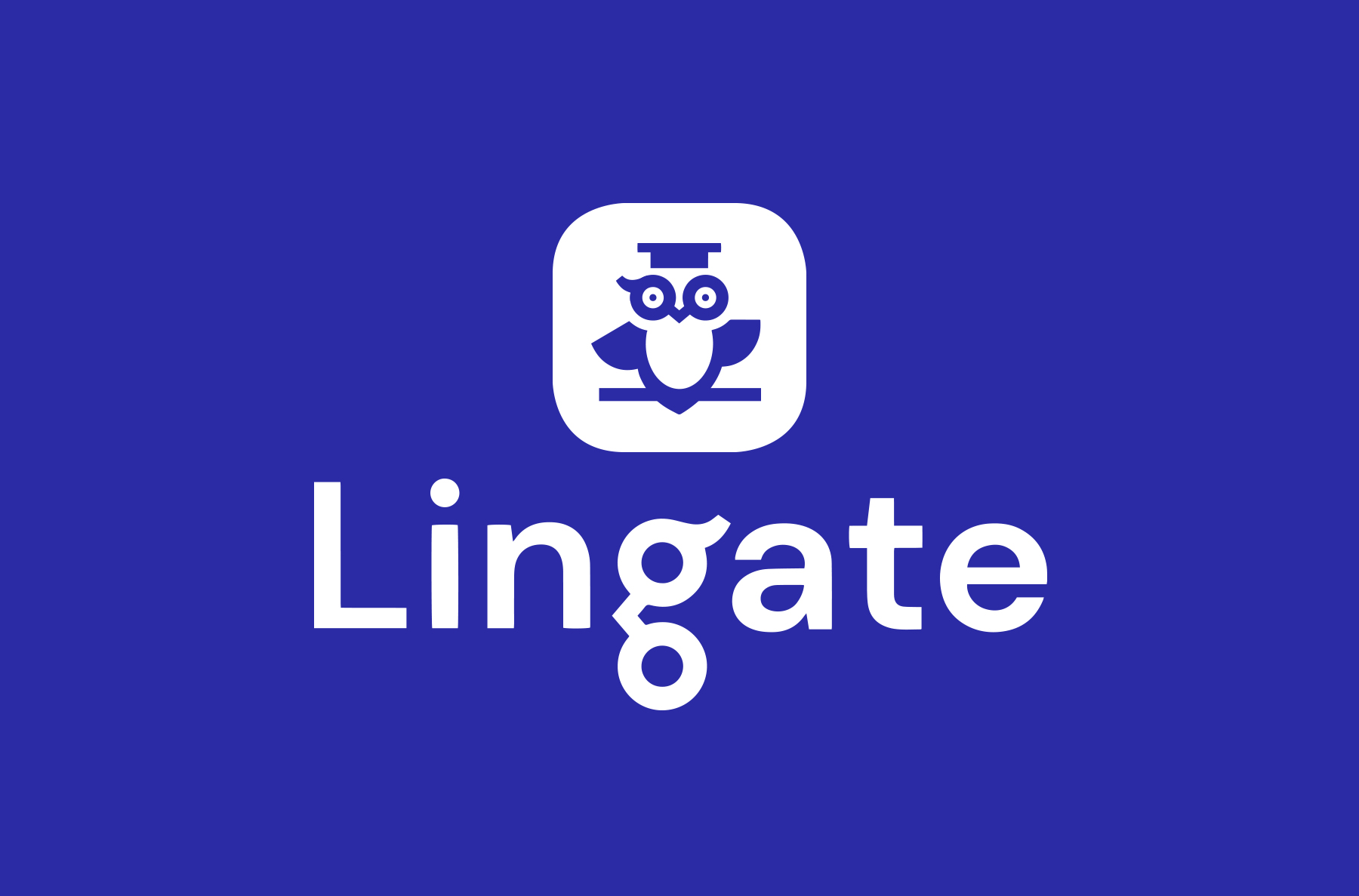
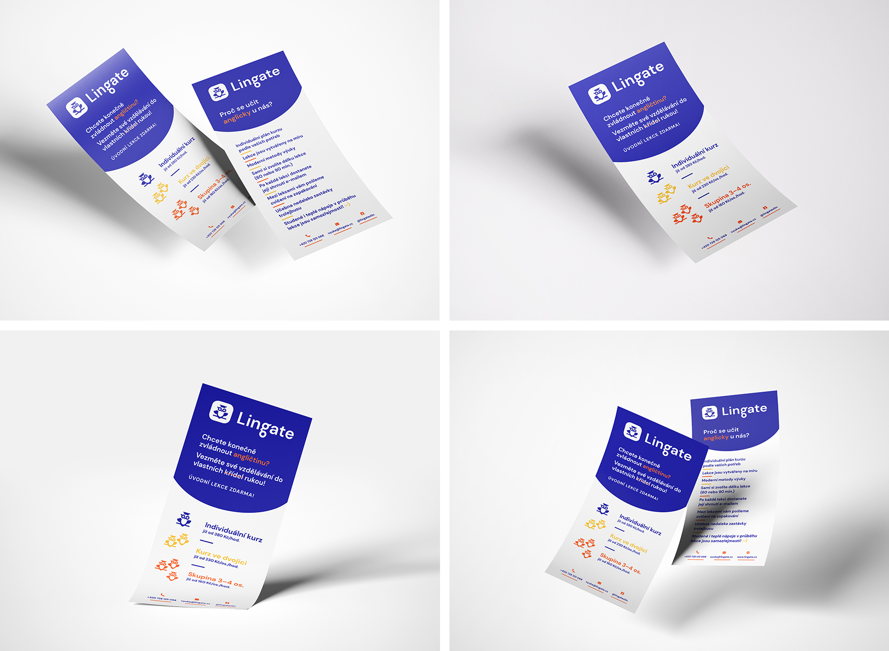
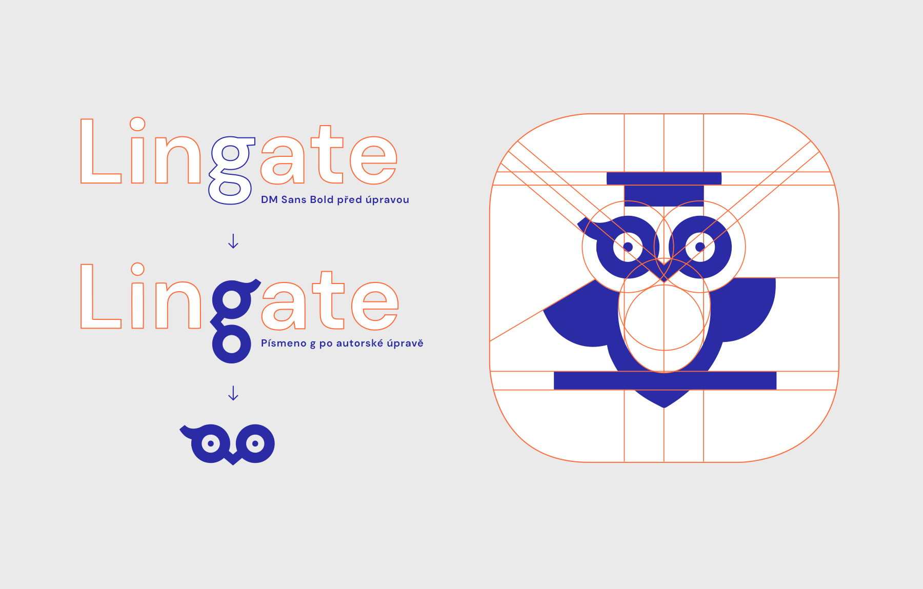
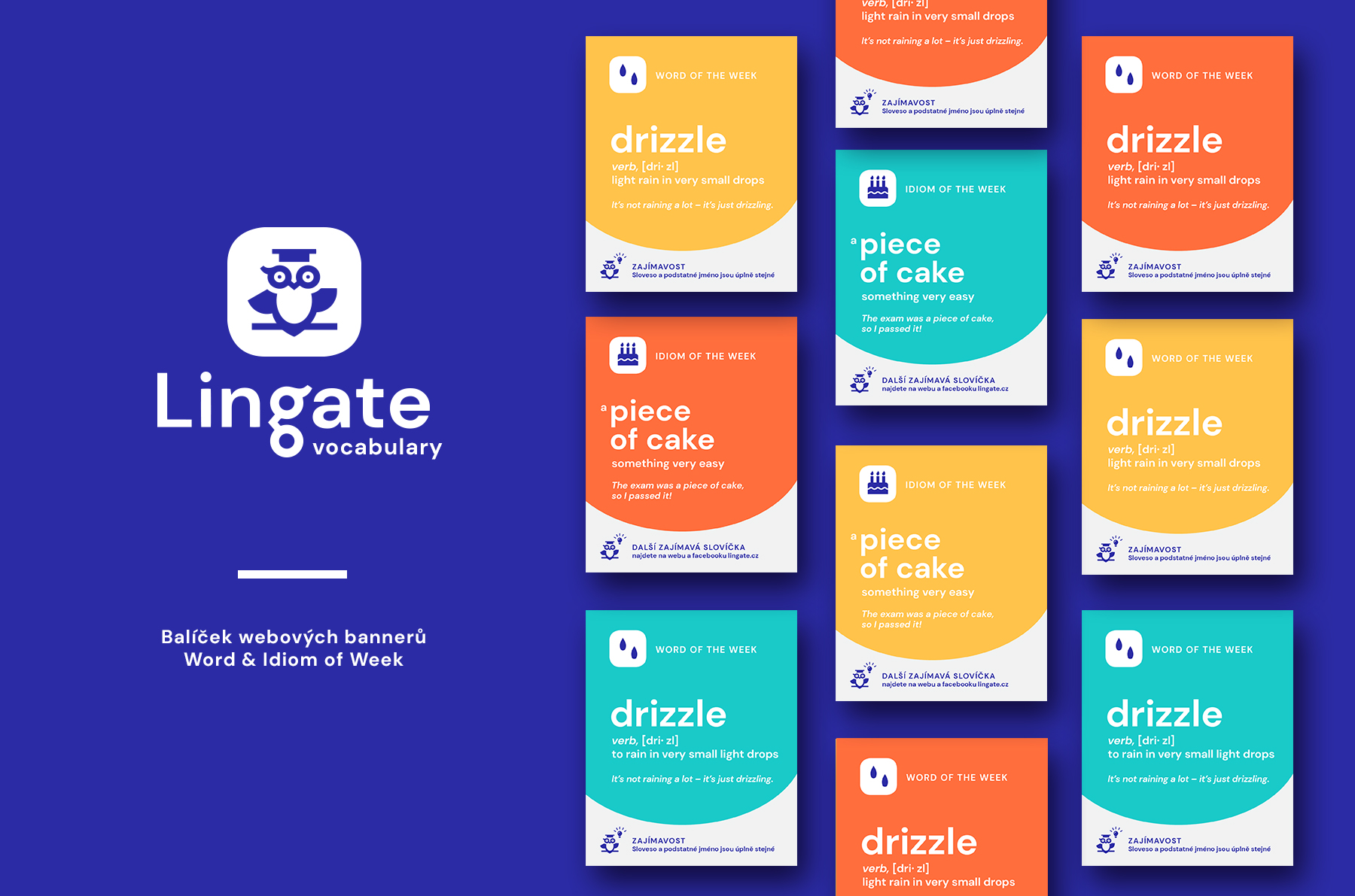
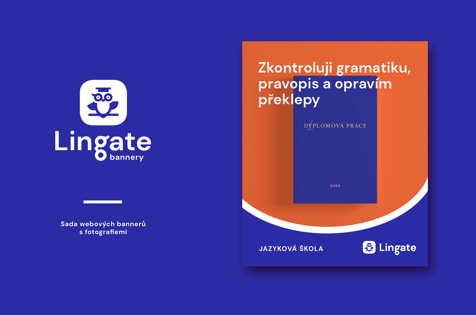
I designed Lingate’s brand and the visual identity that followed. I managed to find a principle thanks to which I connected a graphical symbol with the text part of the logo. I utilised the shape of letter g, which is located right in the middle of the word Lingate. I modified it and used it both in the word and as the basis of the drawing of an owl – I simply turned it 90°, added pupils and suddenly, there were an owl’s eyes. The owl’s rounded belly serves as an accompanying graphical element – I use itas a divide in web banners and leaflets.
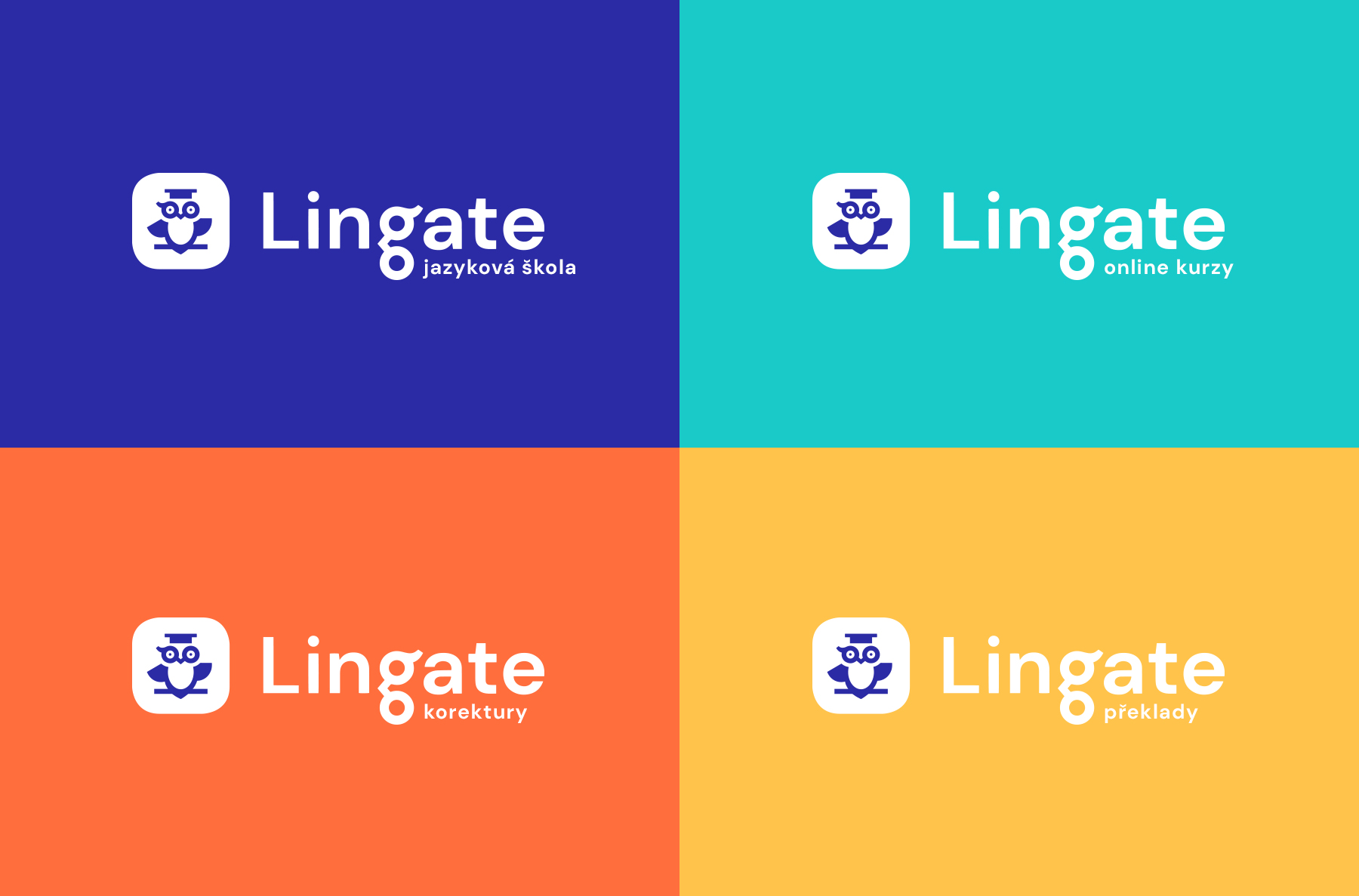
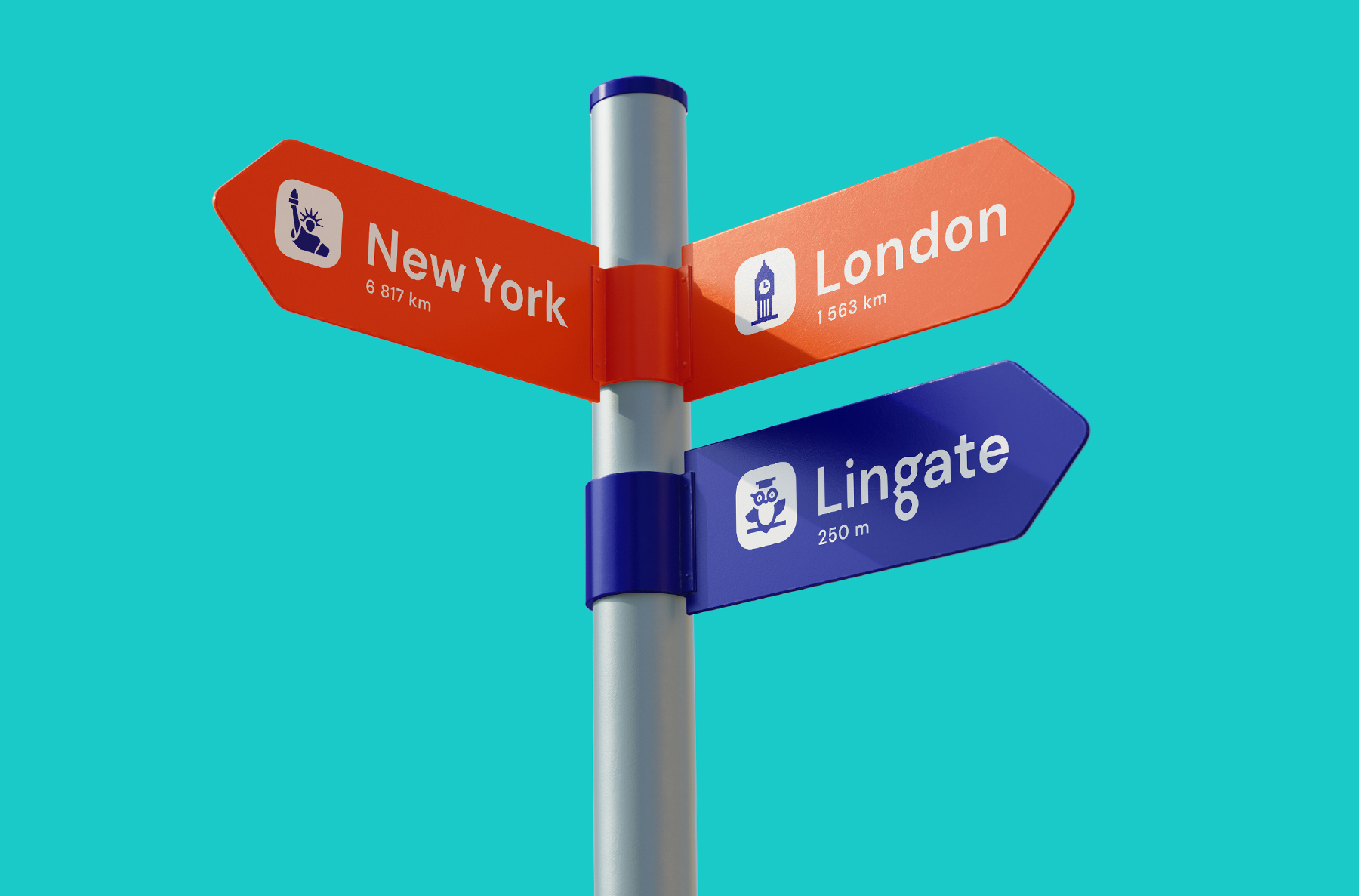
The brand’s colour scheme is based on deep shades of dark blue, orange, turquoise and yellow. Each of the complementary colours represents a different part of the language school’s activities (online, proofreading, translations).