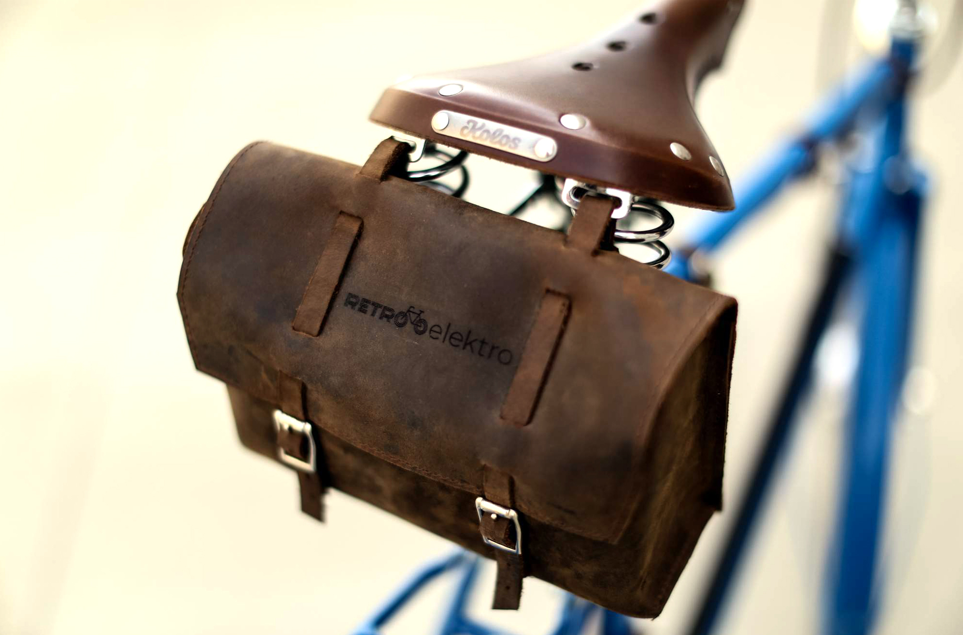
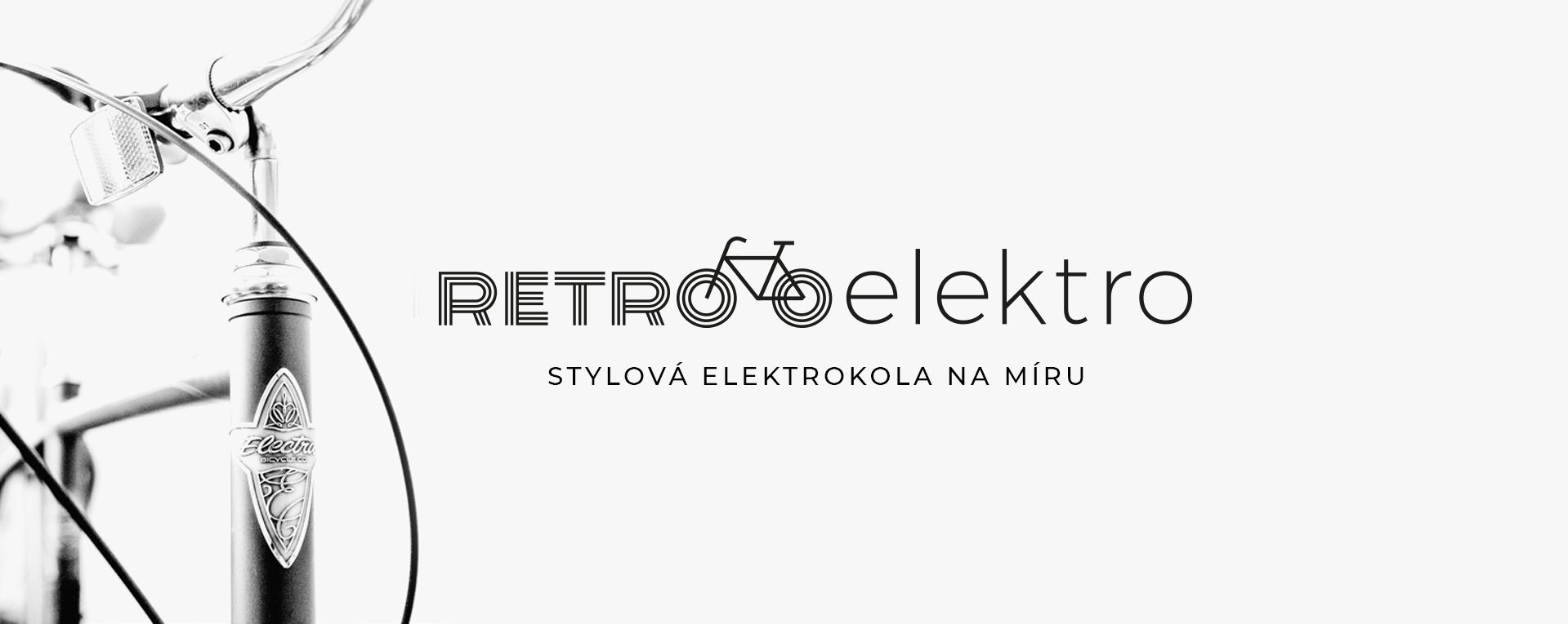


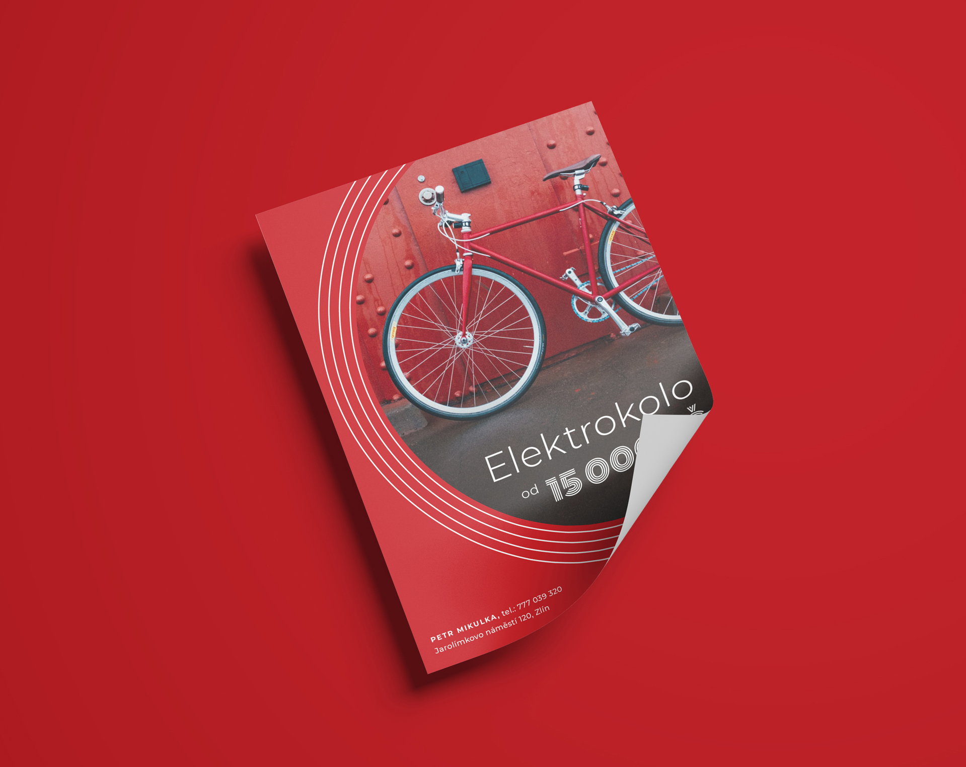
Retroelektro
I created a variable and playful brand for Petr Milkulka’s new company Retroelektro. Petr makes custom-built electric bikes in retro style. He takes reliable old bikes (Favorit, Liberta, Eska), he reconstructs them down to the last screw and equips them with an electric motor.
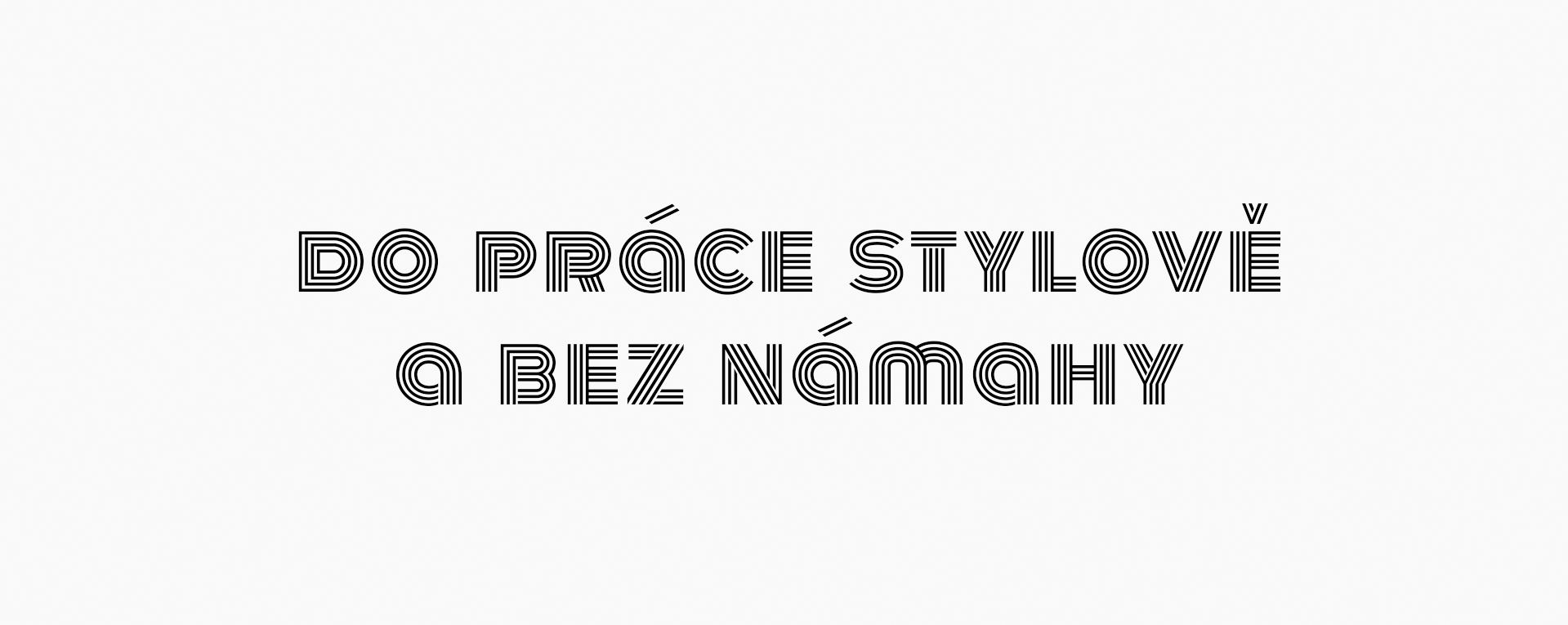
For this brand, I chose a combination of two fonts: more complex retro font and a neutral sans-serif. Uniting element is the symbol of a bicycle with triple lines making up the wheels (which follows the retro font). The symbol can be used on its own or as part of the name. The retro font can be used for headlines of marketing texts, which can then be framed or underlined with a triple line.